Author: Ben Anderson (b.anderson@soton.ac.uk, @dataknut)
A while ago we posted a brief analysis of Christmas Day 2016 which showed that it was a most unusual Sunday. Although there was little evidence of positive ‘spikes‘ in household electricity demand due to synchronised behaviour, HM The Queen’s TV broadcast appeared to cause a distinct negative spike and there were also differences between types of households. So what about Super Saturday, May 19th 2018 which contained not only the FA Cup but a Royal Wedding? Are similar patterns visible?
As before, this analysis uses a stratified random sample of several thousand households from the County of Hampshire, the Isle of Wight and the Cities of Southampton and Portsmouth who are taking part in a large-scale study of energy demand. This sample is representative of these areas but possibly not of the wider UK population and we have been collecting 10 second power demand data from these households since late 2016.
Super Saturday: Just another Saturday?
In order to compare household demand patterns for Saturday May 19th 2018 with neighbouring Saturdays we extracted and aggregated the 10 second power demand data to give mean kW demand over each 1 minute and 5 minute period for the Saturdays before and after May 19th. This gives the plot shown below which also has 95% confidence intervals for the mean kW. These confidence intervals tell us several things, including how much variation there is between households at each time point.
 As we can see, Super Saturday was not that different from most of the adjacent Saturdays. Although difficult to see due to the plot density, demand in the morning appeared to be spike at around 10:30 before falling sharply at around 12:00 when the wedding service began. It then picked up again in late afternoon ready for the football at which point it became largely indistinguishable from the other similar Saturdays.
Strangely the ‘odd one out’ seems to be the 12th May which looks an awful lot like a weekday… why?
Update 1/6/2018: As @tom_rushby pointed out, May 12th was much colder than the Saturdays before/after…
The Royal Wedding: As it happened…
Having looked across adjacent Saturdays, can we use the finer-grained 1 minute data to trace people’s behaviour through the morning of Super Saturday? The annotated plots below show the period 09:00 to 15:00 on Saturday 19th May 2018 using the 1 minute data.
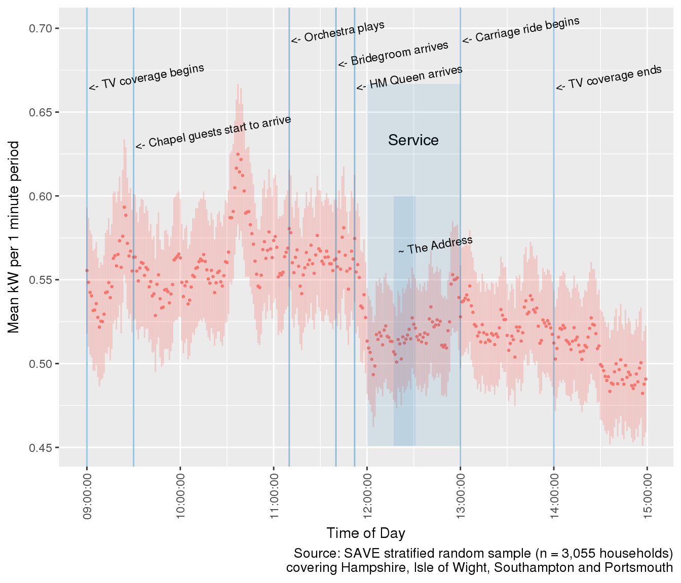 Morning demand showed two peaks, one at just before 09:30 prior to the start of the ‘celebrity parade’ and one at about 10:40. Both may have been caused by synchonised ‘TV switch-on’? Demand then fell sharply as the service began at 12:00. Demand then generally increased as the service progressed through the Address (small dip at start?) towards its conclusion at 13:00 when there was another mini-peak. Demand then fell again as the carriage ride began before trending (with wobbles) downwards after the TV coverage ended.
The following plot separates households by the age of the Household Response Person (HRP) who completed the household survey. As some households are yet to complete a survey, this plot is therefore based on a reduced sample size.
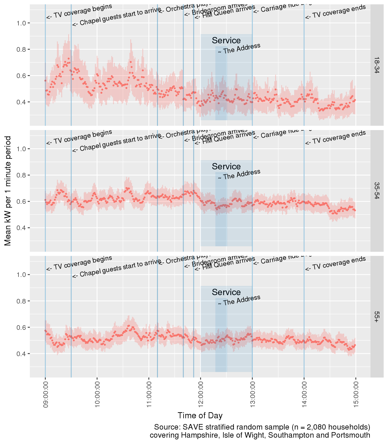 Here we see that younger households (not the 55+ group) contributed to the spike just before 09:30 but all households contributed to the one at 10:40. The drop in demand at 12:00 was most noticeable for younger (age < 55) households who tended to have higher demand in the first place. ‘Younger’ households (18-34 group) showed more variation (paying less attention?) through the service, although this could be due to a smaller sub-sample size. ‘Older’ households (HRP aged 55+) appeared to be the ones reaching for the appliances at the end of the service before watching the carriage circuit of Windsor.
The FA Cup: Who’s watching?
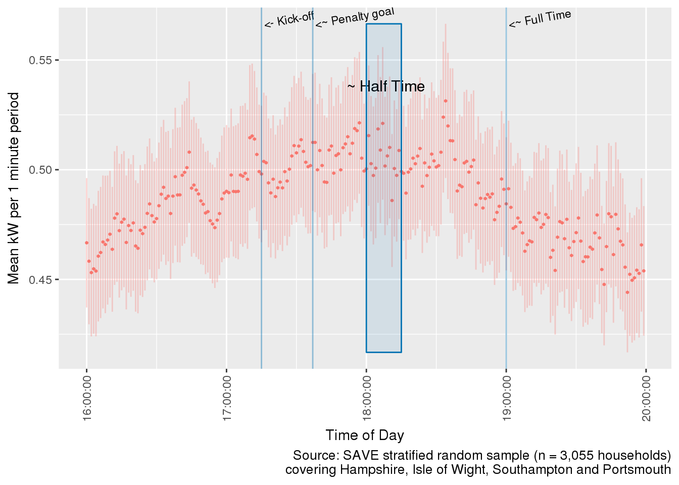
A similar analysis for the early evening of the same day also hints at demand responses. For example the plot below shows a mini-peak just before kick-off with a decline in demand shortly afterwards. There was a small blip around the time of the penalty goal although the error bars indicate substantial variation. Half-time could be marked by additional appliance use although again there is a lot of noise in the data but there is evidence of a mini-spike at ~19:00 when the game finished.
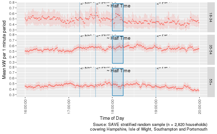
Separating by age as above provides slightly more clarity (see below). For example there is a much more noticeable drop in demand after kick-off for the 18-34 group and a more visible spike around the time of the goal. This group also increased demand substantially at half-time whilst the others did not. The 55+ group in particular appeared to engage in normal Saturday evening cooking (pre 18:00 peak) and eating (post 18:00 dip) habits whether they were watching or not. In contrast the 35-54 group appeared predominantly responsible for the full-time spike at 19:00.
About
This work was funded by:
- the UK Low Carbon Network Fund (LCNF) through the Solent Achieving Value from Efficiency project;
- the EU via an EU H2020 funded Marie Skłodowska-Curie Global Fellowship.
The analysis was generated using knitr in RStudio with R version 3.4.4 (2018-03-15) running on x86_64-redhat-linux-gnu. Analysis completed in 1056.318 seconds (17.61 minutes).
R packages used for base SAVE data processing:
- base R – for the basics (R Core Team 2016)
- data.table – for fast (big) data handling (Dowle et al. 2015)
- Hmisc – for capitalize (Harrell Jr, Charles Dupont, and others. 2016)
- lubridate – for fast date/time conversions (Grolemund and Wickham 2011)
- readxl – reading .xls(x) (Wickham and Bryan 2017)
- readr – fast .csv reading and parseing (Wickham, Hester, and Francois 2016)
- dplyr – data munching (Wickham and Francois 2016)
- dtplyr – data.table data munching (Wickham 2016)
Additional R packages used:
- ggplot2 – slick graphics (Wickham 2009)
- knitr – to generate reports (Xie 2016)
Data Access
Staff and students at the University of Southampton can apply to use anonymised versions of this data for research purposes.